Laundry and creating a blog at the same time...
is an effective way to get things done for the upcoming week ahead. This is new to me, so be a bit patient. But I would appreciate feedback if you have any . The following are some samples of some vis dev work I have done in the past. I have been working in Vis Dev for about 2 years now- it's a bit different than my other background which is layout.
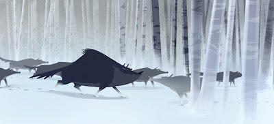
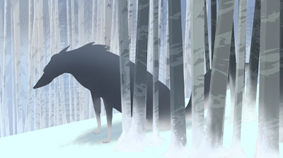
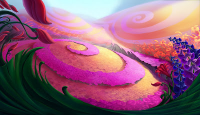
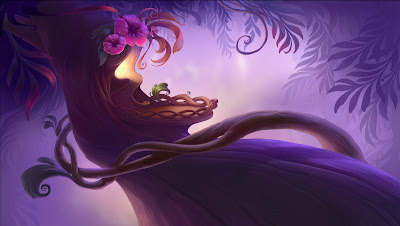
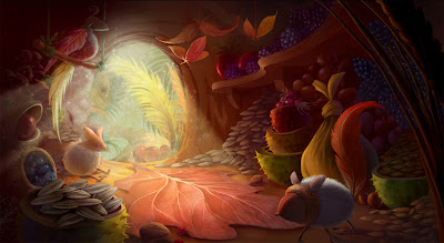
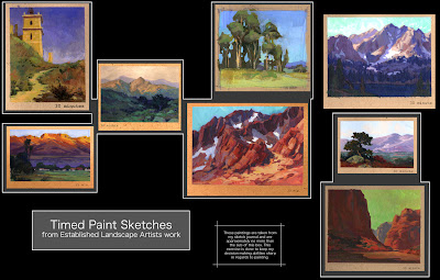
•Paintings•
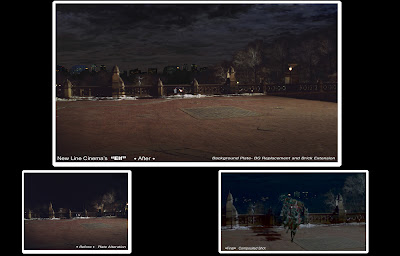
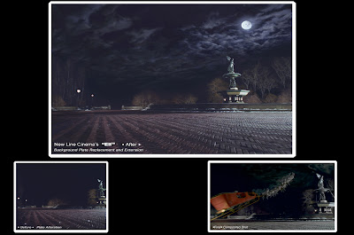
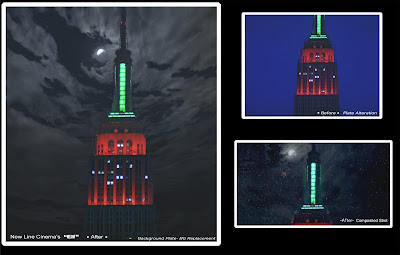
•Matte Paintings• "Elf"- (New Line Cinema)
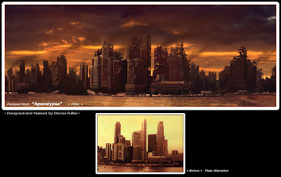
Here are some samples of my work in matte painting. I LOVED matte painting because it was so similar to my background in animation. The only difference is, you work with 'preshot plates' instead of composing/designing/camera work/writing the x-sheet out yourself and then handing it over to the animator. Also- the other difference is that matte painting for live action films is very desaturated in color- meaning alot of grey- no 'bright' colors. Animation- as seen above- is very saturated- because your target audience is kids- so, happy, fun, graphic and obnoxiously bright colors are normally used.
•My First 'Matte' Painting ever•
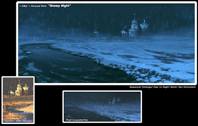
Well, as I was getting ready to leave my post at Disney in 2001- I sat down at the community computer on the 3rd floor and learned photoshop. An old ACCD classmate of mine convinced me that there was a brighter world out there and that with my background in Layout, it would be a natural transition over into matte painting. This lovely day to night shot- was done at 600dpi (because I didn't know what I was doing) and it's fairly successful- yet lacks the sublties of a true matte shot. Any good compositer will tell you that it needs reflections in the stream- and just small nuances that make it shine. Still- not bad- except it took me six weeks to do it, and in the real world, you are lucky to have just one week to complete a painting like this. FYI, most matte paintings are done at 72 dpi- and at 2K,4K or 6K, depending on how close the camera will get to the painting. Now with the HD- the logistics are a bit different-but the general rule of thumb is that if they tell you they want a 2K matte- to be safe, paint it at double the size (4K).
this was the second one that I did..... and I would comment on this one also- but I think that is not necessary at this point.
•Tileable SkyBox Matte Paintings• for EA games•
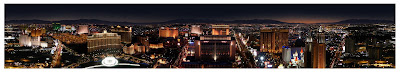
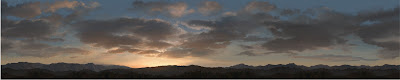
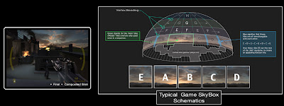
The following 2 paintings are for one of the James Bond games that I worked on. Below each picture is a diagram of how the skybox within an environment is put together regarding texture tiles. Personally- I thought this process was facinating. Each square was no bigger than 512Ksq., in the Fort Knox painting you only have 2 'hero' tiles (master tiles- only used once) and the rest are interchangable with each other. The Vegas painting is a bit different- because ALL the bottom tiles are 'hero' tiles because that skyline is so distinctive that one needs have your painting budget there- so the rest of the sky was a simple gradient that was interchangable with each other.

•Television Background Painting•
Remember me talking about those bright, obnoxious colors? Well- that is the hallmark of television animation. I worked on a warner brother's cartoon called 'Coconut Fred's Fruit Salad Island'- and had a blast. I think that I averaged 7 paintings per week- where you paint the 'keys' and the overseas studios paints up the rest of the bg's based on your 'keys' so that the sequence has a consistant look to it.

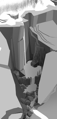
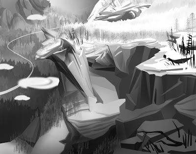
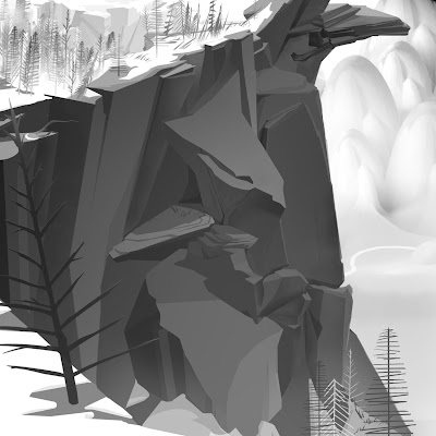
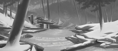
•Environment Design•
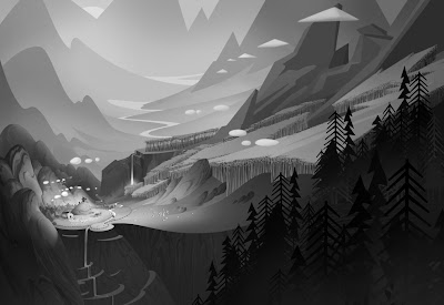
I had the good fortune to work with Sam Michlap and Dan St. Pierre again on a recent film- I designed one area of the world- and I did that by building a rough maya model, taking screen shots of the camera angles that I wanted, and then painted in black/white over it. I had planned to paint these all up in color- but the production got canceled midstream. So, now I have some lovely black and white story moments and location designs- which is fine. For the moment that is.....
•Tarzan• Master Bedroom Interior• Set Design
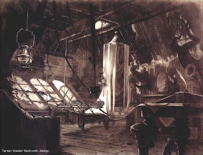
It took me 3 months to design this shot, partly because the look of the film had not been established yet. The directors wanted a more moody, darker and mysterious feel to the jungle area and they felt that this tonal of the treehouse interior really hit the mark. They wanted the humans to feel a bit unsettled in their new environment, and I used items that would have washed ashore from the shipwreck and boat paraphanellia coupled with jungle to resolve the issue. I gleaned from my extensive backpacking experience when I was younger on "what you want verses what you need" when out in the boonies..... needless to say, I refuse to backpack anymore. Unless of course, there is a five star hotel at the end of the trail waiting for me.
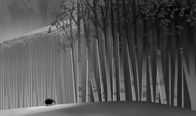
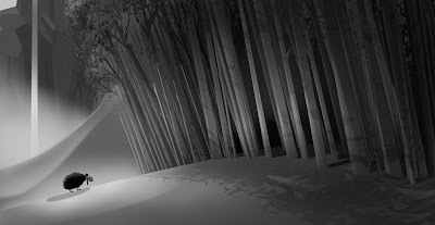
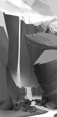
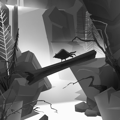
•Misc Stuff•
So, I'll go ahead on a nightly basis and keep uploading my work from the 'archives'- I have ALOT on hand...


•Paintings•


•Matte Paintings• "Elf"- (New Line Cinema)
Here are some samples of my work in matte painting. I LOVED matte painting because it was so similar to my background in animation. The only difference is, you work with 'preshot plates' instead of composing/designing/camera work/writing the x-sheet out yourself and then handing it over to the animator. Also- the other difference is that matte painting for live action films is very desaturated in color- meaning alot of grey- no 'bright' colors. Animation- as seen above- is very saturated- because your target audience is kids- so, happy, fun, graphic and obnoxiously bright colors are normally used.


•My First 'Matte' Painting ever•

Well, as I was getting ready to leave my post at Disney in 2001- I sat down at the community computer on the 3rd floor and learned photoshop. An old ACCD classmate of mine convinced me that there was a brighter world out there and that with my background in Layout, it would be a natural transition over into matte painting. This lovely day to night shot- was done at 600dpi (because I didn't know what I was doing) and it's fairly successful- yet lacks the sublties of a true matte shot. Any good compositer will tell you that it needs reflections in the stream- and just small nuances that make it shine. Still- not bad- except it took me six weeks to do it, and in the real world, you are lucky to have just one week to complete a painting like this. FYI, most matte paintings are done at 72 dpi- and at 2K,4K or 6K, depending on how close the camera will get to the painting. Now with the HD- the logistics are a bit different-but the general rule of thumb is that if they tell you they want a 2K matte- to be safe, paint it at double the size (4K).
this was the second one that I did..... and I would comment on this one also- but I think that is not necessary at this point.

•Tileable SkyBox Matte Paintings• for EA games•
The following 2 paintings are for one of the James Bond games that I worked on. Below each picture is a diagram of how the skybox within an environment is put together regarding texture tiles. Personally- I thought this process was facinating. Each square was no bigger than 512Ksq., in the Fort Knox painting you only have 2 'hero' tiles (master tiles- only used once) and the rest are interchangable with each other. The Vegas painting is a bit different- because ALL the bottom tiles are 'hero' tiles because that skyline is so distinctive that one needs have your painting budget there- so the rest of the sky was a simple gradient that was interchangable with each other.


•Television Background Painting•
Remember me talking about those bright, obnoxious colors? Well- that is the hallmark of television animation. I worked on a warner brother's cartoon called 'Coconut Fred's Fruit Salad Island'- and had a blast. I think that I averaged 7 paintings per week- where you paint the 'keys' and the overseas studios paints up the rest of the bg's based on your 'keys' so that the sequence has a consistant look to it.


•Environment Design•
I had the good fortune to work with Sam Michlap and Dan St. Pierre again on a recent film- I designed one area of the world- and I did that by building a rough maya model, taking screen shots of the camera angles that I wanted, and then painted in black/white over it. I had planned to paint these all up in color- but the production got canceled midstream. So, now I have some lovely black and white story moments and location designs- which is fine. For the moment that is.....


•Tarzan• Master Bedroom Interior• Set Design

It took me 3 months to design this shot, partly because the look of the film had not been established yet. The directors wanted a more moody, darker and mysterious feel to the jungle area and they felt that this tonal of the treehouse interior really hit the mark. They wanted the humans to feel a bit unsettled in their new environment, and I used items that would have washed ashore from the shipwreck and boat paraphanellia coupled with jungle to resolve the issue. I gleaned from my extensive backpacking experience when I was younger on "what you want verses what you need" when out in the boonies..... needless to say, I refuse to backpack anymore. Unless of course, there is a five star hotel at the end of the trail waiting for me.
•Misc Stuff•
So, I'll go ahead on a nightly basis and keep uploading my work from the 'archives'- I have ALOT on hand...


posted by Denise Blakely Fuller at 8:57 PM
59 comments
![]()
![]()
